The Use of Color in Design
Often when designers think about the heavy use of color with interfaces, the mind will usually travel to beautiful eye-candy posts from a variety of portfolio resources, such as Dribbble and Behance. These designs range from playful experimentation to serious concepts; most being incredibly pleasant to the eye of the viewer. However, one question is ever-present: are these artfully-crafted interfaces friendly and easy to use for all users? Color is much more than a shiny palette, it is a powerful tool in user experience design. Color is not only eye candy, but also about accessibility.
User Centered Design
Inherently, User Centered Design (UCD) for software is ultimately about communicating information between people. Even within very specific user types there are many considerations that good design must account for; non-the-least accessibility and usability of the graphical user interface (GUI) with most modern computer / communication devices. UCD is an inclusive design process generally, not exclusive. The Americans with Disabilities Act (ADA) Section 508 is a required consideration for all publicly accessible government Information Technology in the United States:
”…is a civil rights law that prohibits discrimination against individuals with disabilities in all areas of public life, including jobs, schools, transportation, and all public and private places that are open to the general public. The purpose of the law is to make sure that people with disabilities have the same rights and opportunities as everyone else.”
In the context of our discussion here, there will always be a sizable percentage of any user base that suffers from some form of color vision deficiency. As designers, we have the responsibility to ensure as much as we can that any use of color in designs accounts for accessibility considerations of this subset of any user base.
Considering Color and Accessibility
In reality, not every single user’s accessibility needs with a product or interface can be completely addressed, even when that is the goal. However, there are many steps and considerations to take that can be applied to our work to ensure designs are as inclusive as possible. Though designs will require compliance with a variety of requirements like Section 508 of the ADA, they can still retain a high level of aesthetics; remaining an engaging experience and visually appealing to all users.
Color, in particular, is one such opportunity as a vehicle for communicating information, with the cultural background as one influence to its perception. Questions can arise such as: How does one apply color in a design system? Does it’s use align more with usability or just aesthetics? What happens if the user has a visual impairment and cannot read a color codification? The resultant communicated information of such a system could be compromised, leading to a frustrating, even inaccessible user experience. This is not an intention or result desired with any good design.
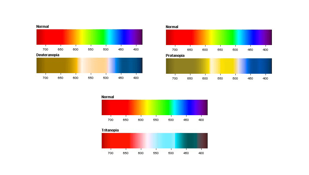
Regarding color-specific visual disabilities, there are different types of Dichromacy (two out of the usual three light cones are available to process light):
- Protanopia (Red Green color Blindness)
One finds it difficult to distinguish between blue and green or red and green because of defective long-wavelength cones or L-cones missing at all.
- Deuteranopia (Red Green color Blindness)
One lacks the medium wavelength sensitive cones which are green, then merges red and green and is unable to differentiate between the two colors.
- Tritanopia (Blue-Yellow color Blindness)
This affects the short-wavelength cone (S-cone) making it confusing to distinguish between blue and green or yellow and violet.
Source: http://www.color-blindness.com/
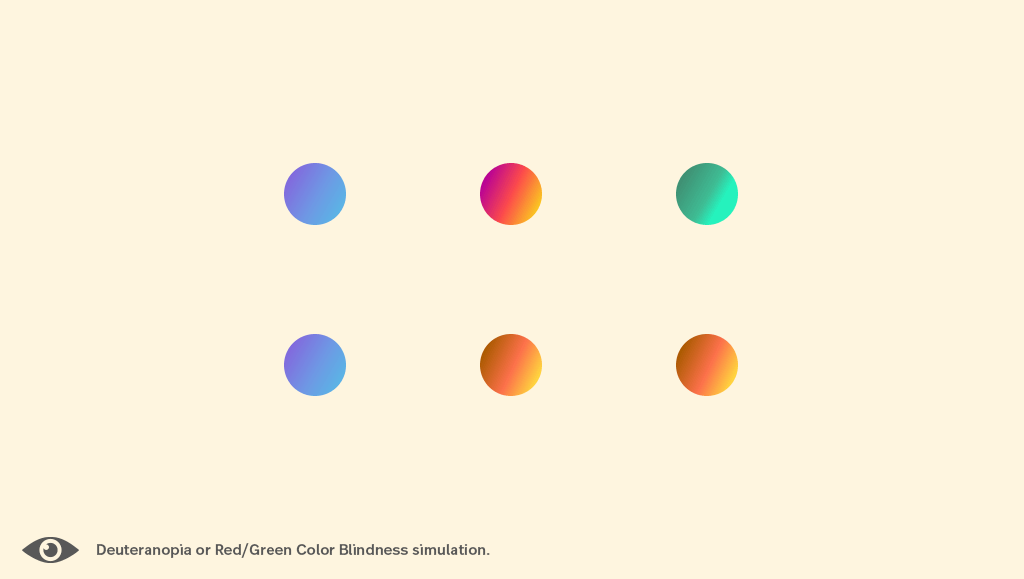
The most common form of color vision deficiency in most populations is Red/Green color blindness, or Protanopia. Users with Protanopia and Tritanopia may have trouble while trying to collect visual information to interact so one should consider color as insufficient to establish the state as information (or buttons: enable/disable). For example, if our digital product has one red field for the error message and a green field for success, with no contextual wording or icons helping to decode, a user with Deuteranopia might not pick up on a status codification.
There is Support!
To ensure accessibility and inclusiveness in designs and interfaces, we can rely on the Web Content Accessibility Guidelines (WCAG 2.1) provided by the World Wide Web Consortium (W3C). This will guide our work in terms of accessibility. US Federal agencies need to adhere to ADA Section 508 Compliance, ensuring electronic and information technology remains accessible to users among a wide range of special needs. The Revised 508 Standard requires conformance with WCAG 2.0 level AA.
If you work outside the US you can check Laws and Policies by Country here.
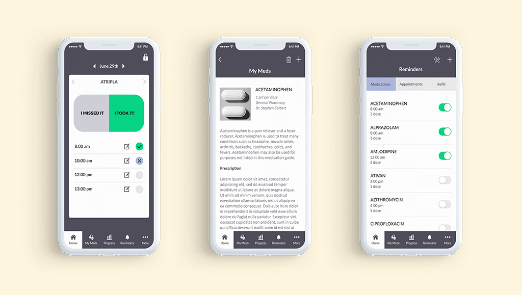
When Mobomo worked on the redesign of the Effective Interventions website and the Every Day Every Dose Mobile App, we applied the accessibility guidelines thus creating 508 compliant products. It’s necessary to incorporate periodic checks of compliance in the design process. (checking color contrast here or another kind of simulations here).
Color is important in UX and it is a lot more than having great shiny palettes. It is about using color as a relevant layer of communication that helps the user understand context, functionality and interaction. One should remember that not everyone will see or read the same way, so inclusive thought is of the utmost importance and the essence of User Centered Design.
If you’re a student interested in user experience and interfaces, it’s advisable (relevant to present and future direction of your skill sets but would also classify) to incorporate this knowledge and these considerations. If you’re already a professional designing interface or involved a digital product project right now, you may start looking at this if you didn’t before. If you’re a great designer that already knows all this, you can pin and share this article to have the information gathered in one place!


