With so many devices and screen sizes, it can be difficult balancing act to make your site look great and perform well. Displaying low res images on a high res display can make a site look terrible. On the other hand, serving high res images to a low res device can needlessly create a sluggish experience. Responsive images can help.
NOTE: Responsive image techniques are best used for CONTENT images (<img src=””>). For background images, you can and should use CSS media queries to control how the image is displayed across various devices.
The goal of responsive images is to provide multiple image sources and any other details the browser may need when deciding on an image.
WARNING: Parts of the syntax are very weird and the results may seem weird due to the long list of factors at play. These factors include, but are not limited to:
-
Viewport size
-
Image size
-
Image display size
-
Screen Pixel Density
-
Cache
-
Browser
-
*Bandwidth
-
*Browser settings (User preferences)
*Not currently implemented
Introducing the source set attribute:
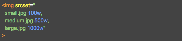
Srcset allows us to provide multiple image sources as well as the size of each image. It may seem odd to inform the browser of our image sizes, especially since the browser can easily determine this on its own. However, the reasoning behind this is to give the browser a leg up on the selection process; allowing the browser to intelligently decide, prior to downloading, which image to request.
Taking it one step further with the sizes attribute:

The sizes attribute allows us to inform the browser of the image size being displayed on a page. It includes syntax similar to CSS media queries for responsive layouts where the image display size is determined by the layout.
Again, it may seem odd to inform the browser of something it can easily calculate on its own or it may seem odd to include redundant code from CSS, but providing this info before the browser even has the CSS files will improve performance.
A bit more control with the picture element:

Lastly, the picture element provides more control, using media queries, to explicitly narrow down the browser’s selection of image choices. This is useful for implementing art direction or when image sizes change so dramatically they must be uniquely cropped for every layout.
Responsive images can be complex. However, when done properly, they can provide the very best experience for any situation.
For more details check out our codepen:
[codepen_embed height=300 theme_id=1 slug_hash=’qdMQdb’ user=’Mobomo LLC’ default_tab=’result’ animations=’run’]

