WHO WE ARE
Rebranding for any company is an evolution of itself. It can mean a new logo, name, symbol or design conformed into one new identity. Once known as two separate companies, Intridea and Mobomo officially became a single website & mobile application development company around 5 months ago. Instead of renaming the company we decided to keep the name Mobomo (we liked their name better)!
After the merger was finalized the next step was to develop a new identity for the our newly formed family, we had to figure out “who” we are as an agency. Luckily, we shared the same vision for “who” we wanted to be which made things fairly straightforward, but I know that this isn’t the case for all rebrands. WE are energetic, WE are agile, We ARE MOBOMO!
Any company whether they are rebranding or not should be eager for new changes and ideas that can further propel their brand which ultimately leads to success. A company that is stagnant or doesn’t have the drive or push is destined to fail. A key to any rebranding process is taking all your learnings, both internally and externally, and applying them to your new identity. Along with applying your best practices learned through experiences it is important to listen, be open to all ideas and try new concepts, if not change will never occur thus a stagnant company is inevitable. In this post I’d love to walk you through our REBRANDING process as well as our newest developments to our new brand that makes it what it is today.
OUR LOGO
A logo or icon represents a company’s name, when someone sees that logo they immediately associate with a particular company or brand. As a newly formed identity, we decided a new logo was an immediate next step. After weeks of deliberation, our new company logo was decided on- the hummingbird. A hummingbird to us perfectly combines the energy we put into each project, with the gracefulness and agility that comes with a team who is able to rapidly shift to the needs of our clients.

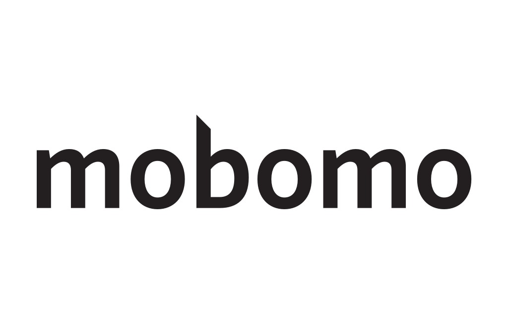
The new Mobomo word mark, is a custom typeface that is strong and commands attention. Capable of standing out in an overly crowded space, and infinitely versatile, the Mobomo word mark stands as a strong foundation of who we are.
Finalizing THE BRAND
Selecting the right font can be detrimental to a new brand and as the first rule of thumb.. it should always compliment the new logo. For our primary font we chose FF Real for it’s simple and elegant, yet strong appearance that translates well across a variety of different mediums. Our secondary font choice is Source Sans Pro, which was selected because it compliments FF Real perfectly and is a great display font.

The color palette we decided on supports our core beliefs illuminating our agile and energetic spirit towards all of our work.

And no redesign is complete without iconography to help tell it’s story. We chose an icon library that works well both on and offline, it is one that’s simple in it’s level of detail but strong in it’s ability to be recognized.
![]()
Combine all of our efforts and you get our final product…!
![]()
By: Mike DelGuidice

