Trends for 2018
In recent years we have moved from Skeuomorphism to Flat Design, in 2017 shadows and gradients made a comeback and we have also seen typography being used as a design element and color taking over our art boards. So what design trends should we expect to see in 2018 for website and app design? We believe this is going to be an eclectic year regarding trends, we’ll see influences from the late 80’s, 90’s and 00’s, bold colors and playful typography – elements from the periods of de-constructivism and brutalism will also be seen in 2018. Now, let’s check out some examples of what we should expect in 2018!
1. Bolder Color
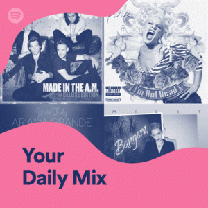
Brands are using vivid, vibrant colors to stand out more, examples of this can be seen in Youtube’s and Spotify’s rebranding in 2017. We should expect to see other brands following suit, changing their colors and probably new brands stepping away from pastels – this is a clear example of the 80’s and 90’s influence in design making its comeback. 
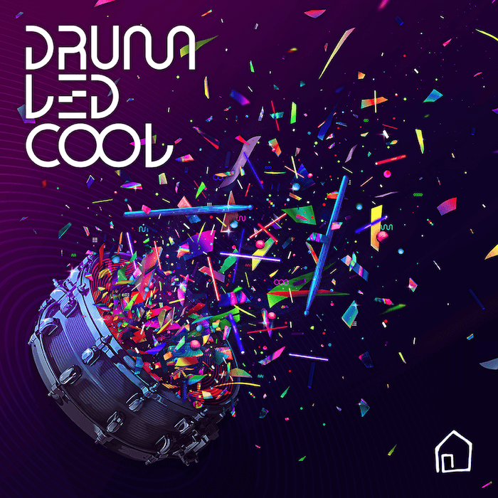
Aside from influencing the choice of brand colors, we will see more neon colors in illustrations, app design, posters, and photography.

2. Creative Typography
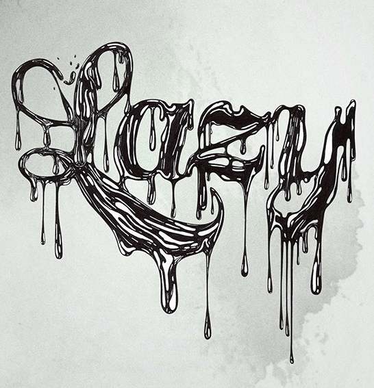
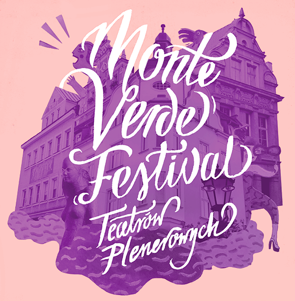
Typography is a great way to convey emotions to an audience and for presenting important information. In 2017 we saw typography used more and more as a graphic piece, it’s bolder and bigger. This year we will see some of the same but it will follow different approaches, for example, font as illustrations, liquid effects, sliced texts, brighter colors, photomasking.
Liquid Effect
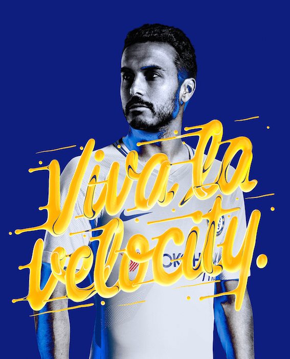
Typography as Illustration


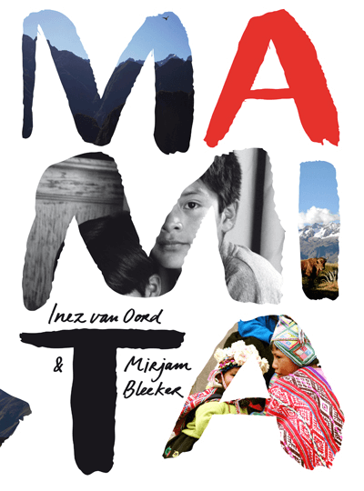
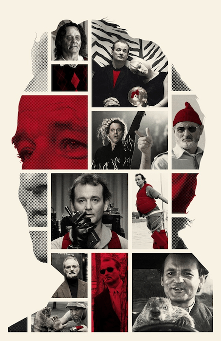
3. Photo Masking
Photo masking is the use of shapes/text elements/ to mask part of a photo in an interesting way, it can be used in different pieces such as, posters, websites, covers. The first image below shows pictures within letters for a magazine cover, the second image shows an array of images that make up the shape of Bill Murray’s head.
4. Organic Shapes
Since the release of iOS 11 we’ve seen more and more rounded corners in app designs, even rounder fonts used, to convey user friendliness and for brands to appear more approachable to their users.

5. Gradients and Gradient Mapping
“A Gradient Map matches Light Levels to different colors. It analyzes the Highlights, mid-tones, and Shadows in your image and maps them to different Colors. The original colors in a photo will be replaced with the Colors in the Gradient Map”. One thing we’ll definitely see more and more this year are gradients in app design and gradient mapping on photography, this will also influence poster design, websites, branding and more!