The dashboard is a critical part of all web applications. It’s the first thing users will see when they visit your website and often times there is some sort of information within the dashboard that the user may be looking for – dashboard web design does not have to be difficult, but I will admit it can be tricky. Here are 5 common pitfalls I see frequently, hopefully this will help you build your next dashboard.
Mistake #1) Believing There Is One Type Of User Dashboard
The dashboard is a critical part of all web applications. It’s the first thing users will see when they visit your website and often times there is some sort of information within the dashboard that the user may be looking for- designing a dashboard does not have to be difficult, but I will admit it can be tricky. Here are 5 common pitfalls I see frequently, hopefully this will help you build your next dashboard.
A dashboard is not a graphical presentation of every aspect of our product. Instead, view it as a launch point for users to quickly access information that simplifies their daily tasks.
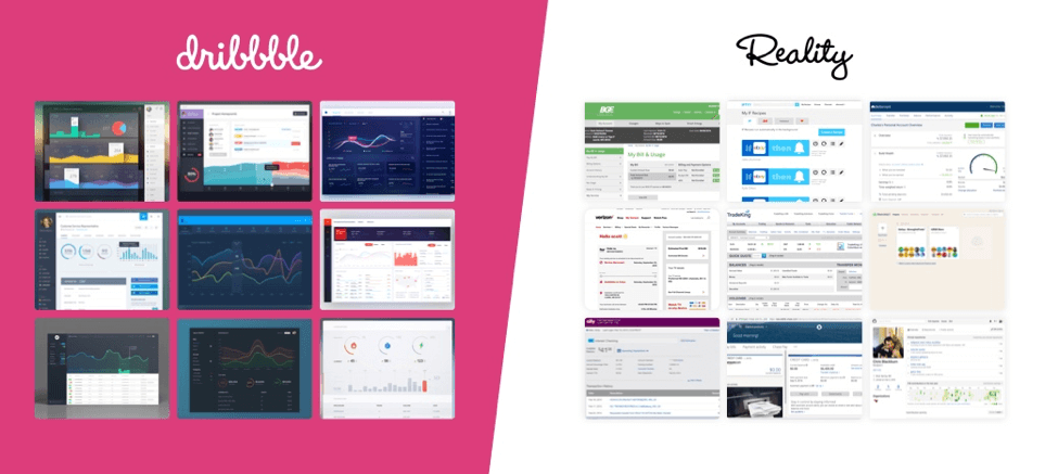
Since the evolution of applications and products, dashboards are no longer a cookie cutter visual experience. We need to use visuals sparingly and focus on actions. Look at the products you use in your everyday life. Next time you log in at your bank or pay for your credit card, pay your cable/electrical bill, or even log into Facebook, do you see a sea of large visual charts telling you about everything? No. All you care about is paying that bill you forgot about. Therefore, stop looking at Dribble for inspiration to create your dashboard concepts because it’s going to lead you down the wrong path. Start looking at real life applications around you or the problems you are trying to solve.
Mistake #2) Assuming You Know What Your Users Wants
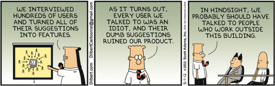
With dashboard web design, your object is to create a forgotten experience when completing their tasks. Why forgettable? Because then we are not asking the user to think. Users only remember bad experiences, a more complicated dashboard equals a bad experience which equals an unhappy user. In order to avoid this, we need to figure out their routines and what information is most important to them. Why are they logging in? How often are they logging in? What types of information are they constantly looking to get? What is working and what isn’t? All of these questions help construct a dashboard that users will love and forget they are using while in the moment. However we answer all these questions in conference rooms and not directly with our user.
We need to stop using the two phrases “I think” and “I believe”, and start saying “We know” and “We have proved” in our meetings.
Your second mistake is thinking you know your users habits. Analytics are fantastic, frankly, I am not sure what we did before they existed, yes you can get user information from analytics but unfortunately, those metrics won’t take you far enough. Before building any product you will need to sit down with your users/target audience and listen. It’s a simple task that companies are sometimes afraid to do before they invest thousands of dollars, which is foolish. If time is of the essence in kicking off your project and the user experience is the hold up, there are simple ways to gain user feedback from your existing user base. Reach out to your newsletter directory and ask them to take a quick 5 min online survey. Showcase a sticky call on your dashboard asking for feedback. These two steps alone can lead to quick and simple feedback in a short period of time that provides more value than before. By knowing what you your user needs and what their habits are will help you towards building an amazing “forgotten” experience.
Mistake #3) Believing That Design Will Solve All Your Problems

There will always be projects that feel like everything is broken. Especially when dealing with a dashboard that hasn’t been recently updated. Our first instinct as a designer is “oh we can make this better, so much better with a modern design!” This is very true, a simple way to refresh your ascetics. We can easily fix the hierarchy and make it feel light and trendy. Also another true statement. However, if we are not solving any user or technical problems in the process there is no point.
Design can only take you so far. If we don’t fix the underlying issues of performance, substance, and ease of use, your users will not care how pretty your charts are.
This causes your third mistake, believing that we can rely on design to make our product and dashboard amazing. It’s easy to make something look modern, but it’s hard to make it work seamlessly. In order to accomplish this, we need to know what the user problems and habits from Mistake #2. Simple things like monitoring your dashboard analytics will easily tell you what links are getting clicked and viewing page load times to see what areas are lagging and how you can refactor the system to speed up the results. All these aspects will help you build a beautiful dashboard that solve the user problems.
Mistake #4) Thinking that User Feedback Comes Only After Launch
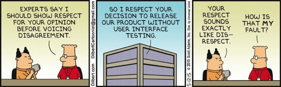
Talk, design, build, test, and launch. It’s a traditional process that companies and design firms use to build your project. Once the product launches, we may get slight feedback, on what works or doesn’t, but will not know for user. An iterative process that is a perfect way to always improve your dashboard. However, when time, resources, or reputation is valued, you can’t always afford to drop the ball for these long feedback loops.
We spend hours in design, development, and meetings talking about what we think is right, but not one minute is taken to verify our ideas with the actual users.
Your fourth mistake is thinking we can wait until a product launches to get actual user feedback on the dashboard. It is a big risk to invest 3-12 months to build an application to find out you drop the ball on the first page. Especially when we can easily obtain feedback at every step of process from concept to final product.
Wireframes and flat designs are not difficult to test with today’s web applications like Invision App which is an interactive prototyping application that brings flat designs to life. Within minutes your designer will have a clickable prototype for you to test your dashboard to your users. Remember, it takes fewer calories to make changes earlier than later after everything is coded. As a result, we’re able to launch a proven dash dashboard that you know solves your users problems.
Mistake #5) Ignoring Your First Time User

When designing our minds always focus on designing for the active state. We start laying the components and solutions when data charts are full, graphs have data, users have messages, and receive notifications. It makes sense that we want to showcase all the possible functionality of our dashboard to meet the user needs.
We forgot the most important user state of all. The first time user. How many times have you signed up for a tree trial and looked around for 30 seconds and said “this makes sense” and close it to never log in again.
This leads to our final mistake when creating a dashboard, we forget about designing for the first time user. This is the most important because it sets the tone for the rest the application. If the dashboard is empty it will confuse the user on what to do next. We immediately set them up for failure. As a result, people will not stop using your application.
A dashboard should always guide the user to accomplish a task even if it’s empty or a first time user. In order do this, we have to design for the first time user’s vision of your dashboard. What will it look like when it’s empty? What task(s) does the user need to complete in order to show information. How can we unobtrusively guide the user around. Simple solutions could be creating a task list for them to complete or even a welcome message at the top with common actions that want to complete. Designing for the first time user will aid usability of your product, but will also help user retention.
Let’s Recap
Creating an amazing dashboard isn’t hard, but isn’t straightforward either. Your application is unique, and your dashboard should be as well. Talk to your users and see what their habits are in addition to their needs. Read between the words to see what they really need and build solutions around that. Remember to also test these assumptions we have made to ensure they are right. And lastly remember your first time users because they will dictate if your product is a success. Check out some of our dashboards that we have done for clients such as: World Bank, Great Minds, and Spark Post.
What design needs are causing you to stay up at night? Get in touch for a free consultation!

